5 Essential Tips for Designing an Effective Spreadsheet
Jason Chan ·
Spreadsheets can often be confusing, cluttered, and hard to navigate. Unless you have years of training as a data or financial analyst, designing an effective spreadsheet can be challenging.
Mastering Spreadsheet Design: 5 Golden Rules
In this article, we will discuss five golden rules for mastering spreadsheet design, to design a spreadsheet that is visually appealing and easy to use and understand.
Rule 1 - The Importance of a Welcome Sheet: Making a Great First Impression
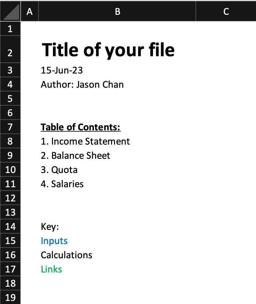
First impressions are always important, and this is especially true when it comes to spreadsheets. The welcome sheet can come in all different shapes and sizes. It can be a table of contents, it could be a well formatted output, or just a generic welcome sheet. The goal of this sheet is to make it easier to give the user a quick overview of the contents and teach them how they can navigate around quickly. Some common things that can be included are the name of the spreadsheet, the date created, any inputs, instructions, links to other files, who should use the file, when the file should be updated, what data sources the file uses, and more.

Rule 2 - Consistency is Key: Adopting a Standard
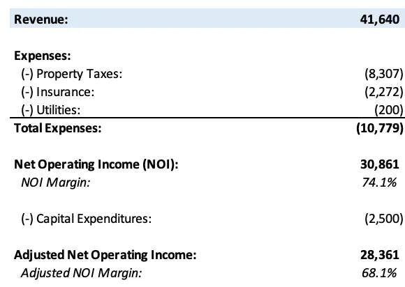
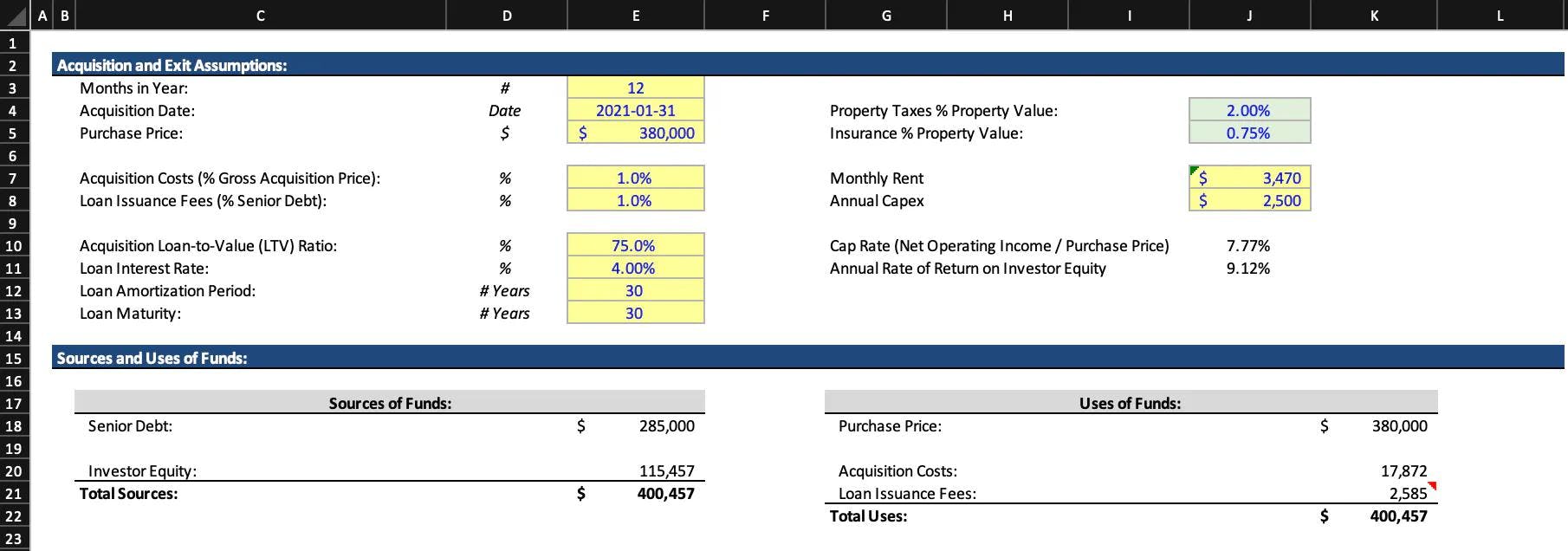
When designing a spreadsheet, consistency is key. By adopting a standard, you can ensure that all your spreadsheets are uniform, easy to use, and easy to navigate. For example, you can use a certain color scheme, font style, and cell formatting for all your spreadsheets. This will help your users understand how to use the spreadsheet easily. Most spreadsheets give you unlimited options on formatting, but at Subset, we only give you a select number of formatting options (based on best practices) so your spreadsheets look great no matter what you pick.
Additionally, keep in mind that consistency is not just about the visual design. It also includes how you organize data and formulas. For example if you prepare one section of your data in alphabetical order, try doing the same in your other datasets. By adopting a consistent approach to data organization, you enable users to easily find the data they need. Another example is if you use a VLOOKUP over an INDEX-MATCH formula, try to use the same formula for other similar analysis. By staying consistent, it makes it easier to audit and change them when needed.
Consistency is especially important when working with multiple collaborators. By agreeing on a standard, you can ensure that everyone is on the same page and that the final product is cohesive.

Rule 3 - Separating Your Data from your Analysis: Organizing Your Spreadsheet Effectively
Organizing your data is crucial to an effective spreadsheet. You should separate your data into separate sheets based on logical groupings or datasets. This makes it easier to find data points and use formulas with accuracy. Additionally, use basic formatting conventions such as headers, borders, colors, or shading to help define and separate data. You can also use conditional formatting to color-code your cells based on data values, so it becomes quickly apparent what’s important.
Once all of your data is laid out, build your analysis separately and link back to the dataset where necessary. Where possible, try to build the formulas in a way that would work if the dataset is updated (for example if it had more or less rows). The benefit of designing your spreadsheets this way is that it makes it way easier to manage and update the file in the future—there is no doubt what part of the spreadsheet needs to be updated.

Rule 4 - Designing for Longevity: Future-Proofing Your Spreadsheet
This is slightly related to rule number 3, but designing for the long run is essential. As your spreadsheet evolves, it's inevitable that you will add more data, more formulas, or additional users. Design your spreadsheet to accommodate these changes by allowing extra rows and columns, and by removing extra formatting or data that is no longer needed. The spreadsheet should be able to support new data sets and users, as well as new formulas or calculation requirements. Save a backup copy before making any major revisions and always test it first. Another proxy to ensure that your spreadsheet is designed for longevity is that it does not have unnecessary data, calculations or analysis. If you can remove parts of the file without it affecting the overall analysis, generally you should. The reason is that as you pass the spreadsheet on to others, including your future self as time passes, a lot of context will be forgotten and additional unnecessary data or analysis will add to confusion.
Rule 5 - Controlling Data Input: Ensuring Accuracy and Consistency
Controlling data input is critical when it comes to an effective spreadsheet. Whether you are entering data manually or using formulas, you should always be vigilant about accuracy and consistency. Use data validation tools, such as drop-down menus, to ensure that data is entered correctly and prevent erroneous data inputs. Additionally, use formulas to automatically calculate numbers. If a number can be derived from other inputs in the spreadsheet, it should be. If you do the calculation in your head and manually input it, you open the door for errors such as typing in the incorrect number or making the wrong calculations.
Wrapping Up: Key Takeaways for Effective Spreadsheet Design
Designing effective spreadsheets can be a time-consuming process, but it's worth the effort. By following the 5 rules in this article, you can create spreadsheets that are not only visually appealing but also easy to use and understand. Remember to design for your audience, organize your data effectively, and think about the long-term impact of your design. Be vigilant about accuracy and consistency, and always test your spreadsheet before sharing it. Also, remember to adopt a consistent approach to design, and use conventions and formatting techniques to ensure your users can easily navigate your spreadsheet.